Cancer Survivors Network
The American Cancer Society’s (ACS) Cancer Survivors Network is a dynamic, online community for its users to interact and share their experiences with cancer. The website was launched in July 2000, but has not been changed since and is now outdated. I worked with Jason Chen, Anne-Sophie Kim, Daya Lee, and Elise Qian to help American Cancer Society increase Cancer Survivors Network’s functionality and usability in preparation for CSN’s refresh in 2018.
Role
UI/UX
Client
American Cancer Society
Location
Pittsburgh, PA
Duration
3 months
Defining Project Goals
I started the Cancer Survivors Network site redesign process with setting project goals. CSN’s team saw this opportunity to support more users on mobile devices and create a brand for Cancer Survivors Network. I used our client’s ask to formulate measurable goals that would define our project proposal and the success of the project:
- Increase retention rate. CSN’s team provided us with Google Analytics showing 45 percent of current users accessed CSN through their mobile devices. Information accessing and content building were the major reasons users used the community-based site. If properly supported on the mobile devices, I reasoned that the retention rate would increase, with more users coming back to the site.
- Realign site to be recognizable with its parent brand. Many people do not recognize Cancer Survivors Network is affiliated with American Cancer Society. I saw an opportunity to take advantage of American Cancer Society’s official resources for CSN’s users, so instead of creating a separate brand for CSN, I wanted to use American Cancer Society’s brand to create an association between the two entities.
Research
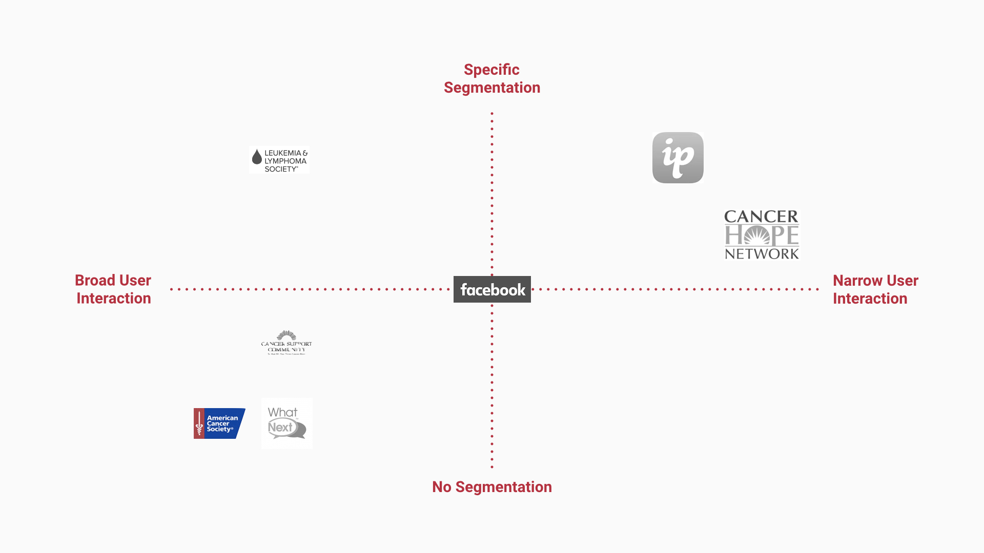
In the research phase, my goal was to understand the support group ecosystem, from identifying the user base to user behaviors and competitors. I worked with my team to create a complete competitive analysis that surrounded in-person and online social support groups for a variety of topics, including cancer, alcoholism, and mental health. I then illustrated the direct competitors against segmentation and user interaction. We also completed a task analysis on common interactions on CSN’s current site and direct competitors. We also interviewed current users to understand their purpose and experience on the site.
Creating Personas
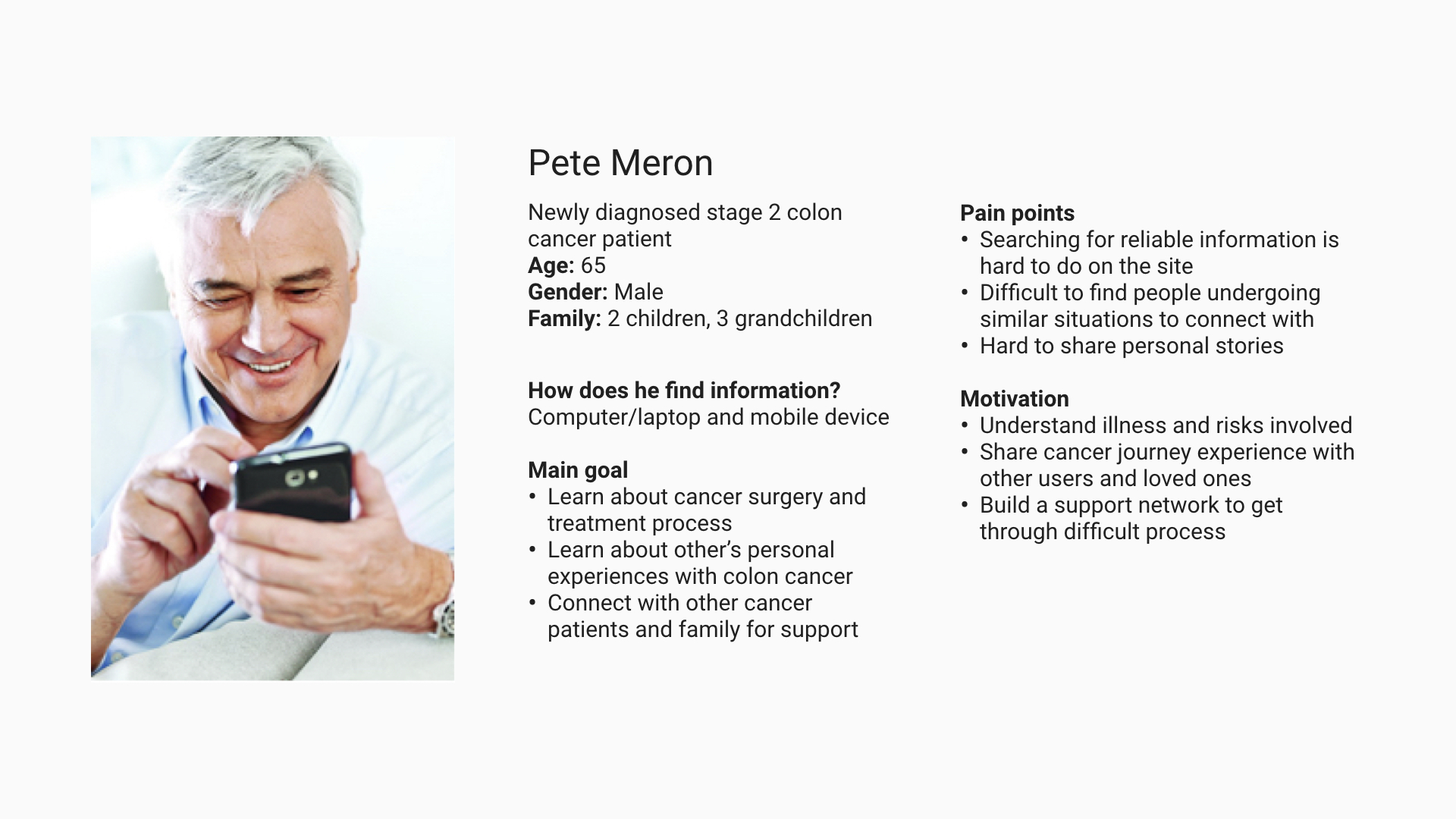
From our research, I recognized three general users for Cancer Survivors Network: seasoned CSN users and cancer patients, newly diagnosed cancer patients, and caregivers and loved ones. We developed three different personas to align with the project goals and to guide us through our design process. The personas helped us focus on and prioritize design considerations that relieved current pain points and helped the user achieve their goals.
Iterating on Designs
We used the personas to prioritize features to include or improve on in the minimal viable product. The four core features we identified were:
- Search. Most users first find Cancer Survivors Network through organic search. I recognized further supporting user’s informational and emotional search directly in CSN was key to user retention and increasing the user base. Users valued directed search and exploratory search to find more information and stories on cancer, so both search types had to be properly supported, making the search function a core component in the MVP.
- Discussion. The primary purpose of Cancer Survivors Network is in its discussion. Community members read and interact in the discussion space, sharing their experiences with cancer or seeking answers from others with experience. Redesigning the discussion experience became an integral component.
- Blog. The task analysis and interviews revealed the “Expressions Gallery” was often confusing for users. Users would not know what “Expressions Gallery” entailed, so when users used the expressions gallery, instead of using it as a means to share emotions, the expressions gallery was misused as either a means to only vent or a secondary space for discussion topics. Addressing the misalignment of understanding between the original expressions gallery designers and CSN users by redefining “Expressions Gallery” to blog became a top priority.
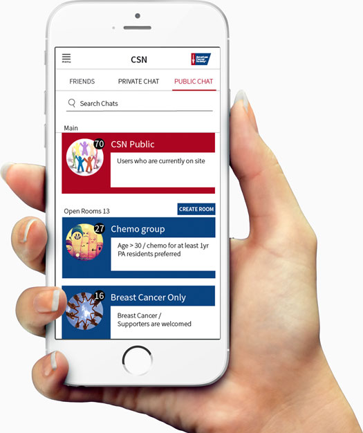
- Chat. From the competitive analysis, I noticed that successful social support groups supported personalized interactions. For example, Leukemia & Lymphoma Society creates office hours to call for specific needs. Since CSN has almost no user segmentation, we had to think of another method to personalize the experience. I thought to expand on CSN’s current public chat model and let users create both private and public group chats, so the topic of conversation would be personalized to those participating in the chat.
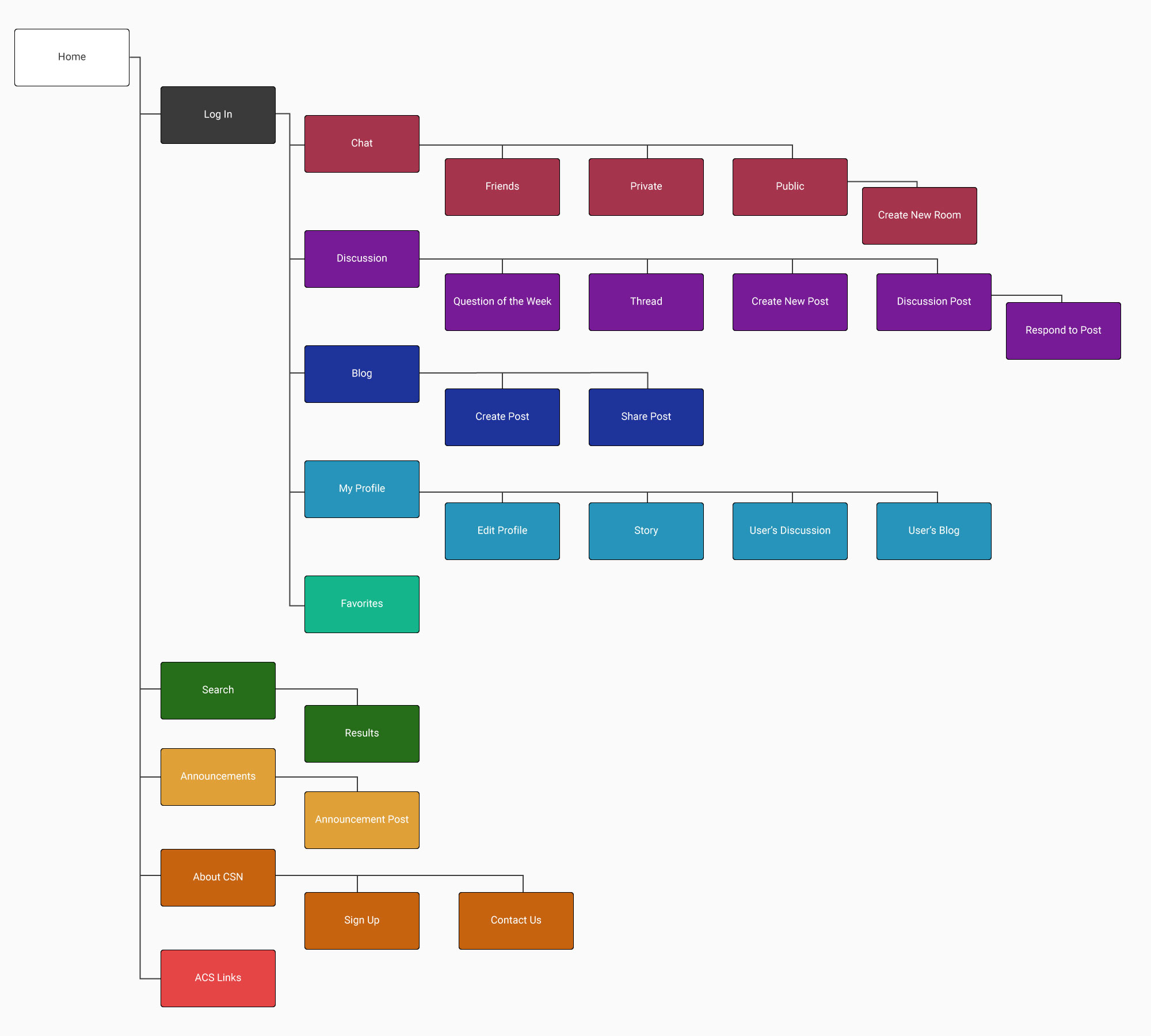
With the feature priorities in mind, I created a site map as an overview to guide us in designing our prototypes and screenflow. We sketched out screens and interactions, created and tested paper prototypes, and iteratively changed and tested our designs through medium-fidelity and high fidelity prototypes on CSN users.
Product Features
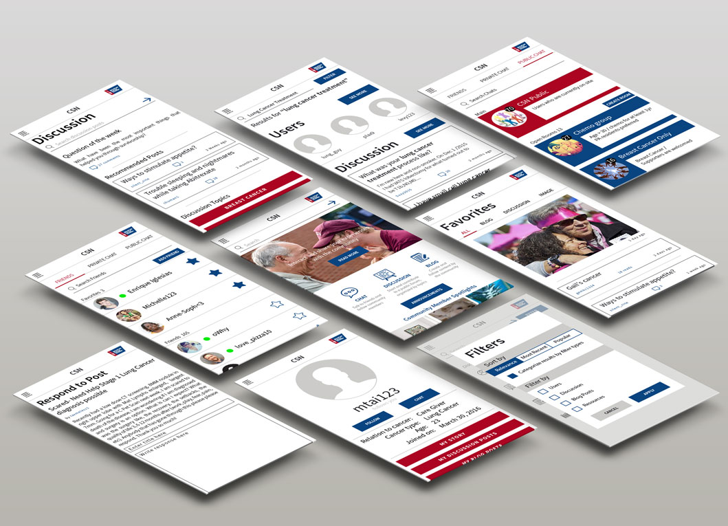
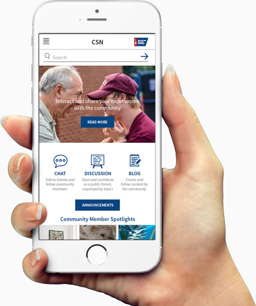
Ease of entry from home. The home page relays to new users and remind old users what CSN is about, what features are offered and most widely used, and highlights respected users.
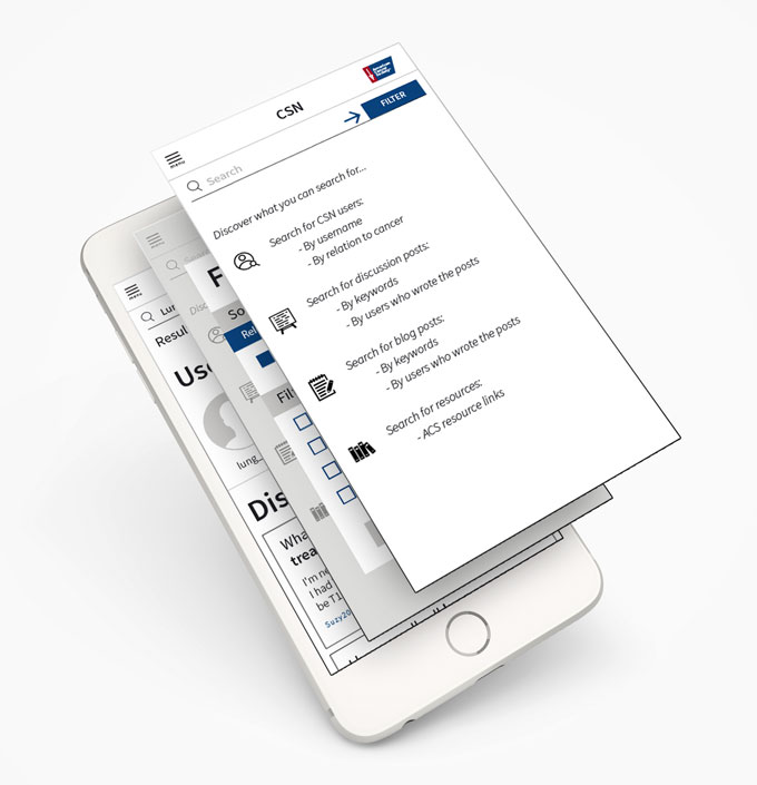
Explore more with search. Oftentimes, Cancer Survivors Network users are first introduced to the site through a search query. Search tips help guide new users to further their cancer search process, whether for emotional support or informational resources, directly in the Cancer Survivors Network platform. At the same time, it simplify the search tools so users are able to complete their search at a quicker pace.
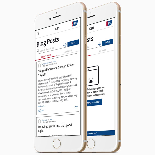
Express creatively in blog. Users can follow a particular person’s entire journey with cancer, whether it is someone who shares the same cancer type, or a person the user cares about. Sharing pieces give users a chance to display they share similar sentiments, and give the user the chance to add on the piece.
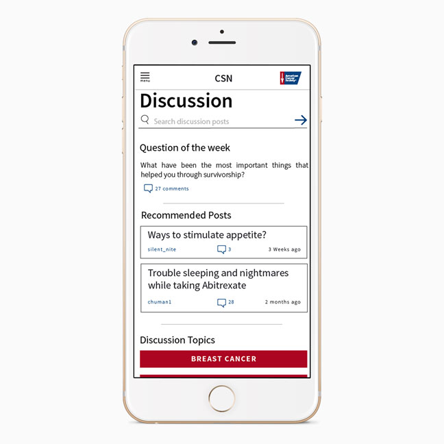
Converse in specific topics with discussion. The discussion page starts with a question of the week, followed by recommended posts and discussion topics. Question of the week encourages user engagement and contribution to the network. The recommendations section helps users find more relatable posts to help users explore subjects and topics that may not have been read previously. Discussion categorized by topics keeps content directly relevant to the user.
Engage regularly with chat. Each chat room holds a description of what can be expected to help users decide which chat rooms to join. The open rooms give users the choice to make or join chat rooms depending on their interests or conditions. This helps users who may have rare conditions or diseases to come together to create a space to talk and chat.
Project Reflection
Through this project cycle, we learned of constraints that was not shared at the time of the brief, and had to incorporate the constraints into design limitations and work around them. A huge takeaway from this project for me is to consistently keep in mind the business need and scope, and to make decisions that bring the most value to the user given existing constraints in time and scope of a project.
I am particularly thankful to my teammates for helping me prep for our client presentations and for contributing to our design analysis report.
Works

NimbleRx | App home and navigation 🗝App interaction design
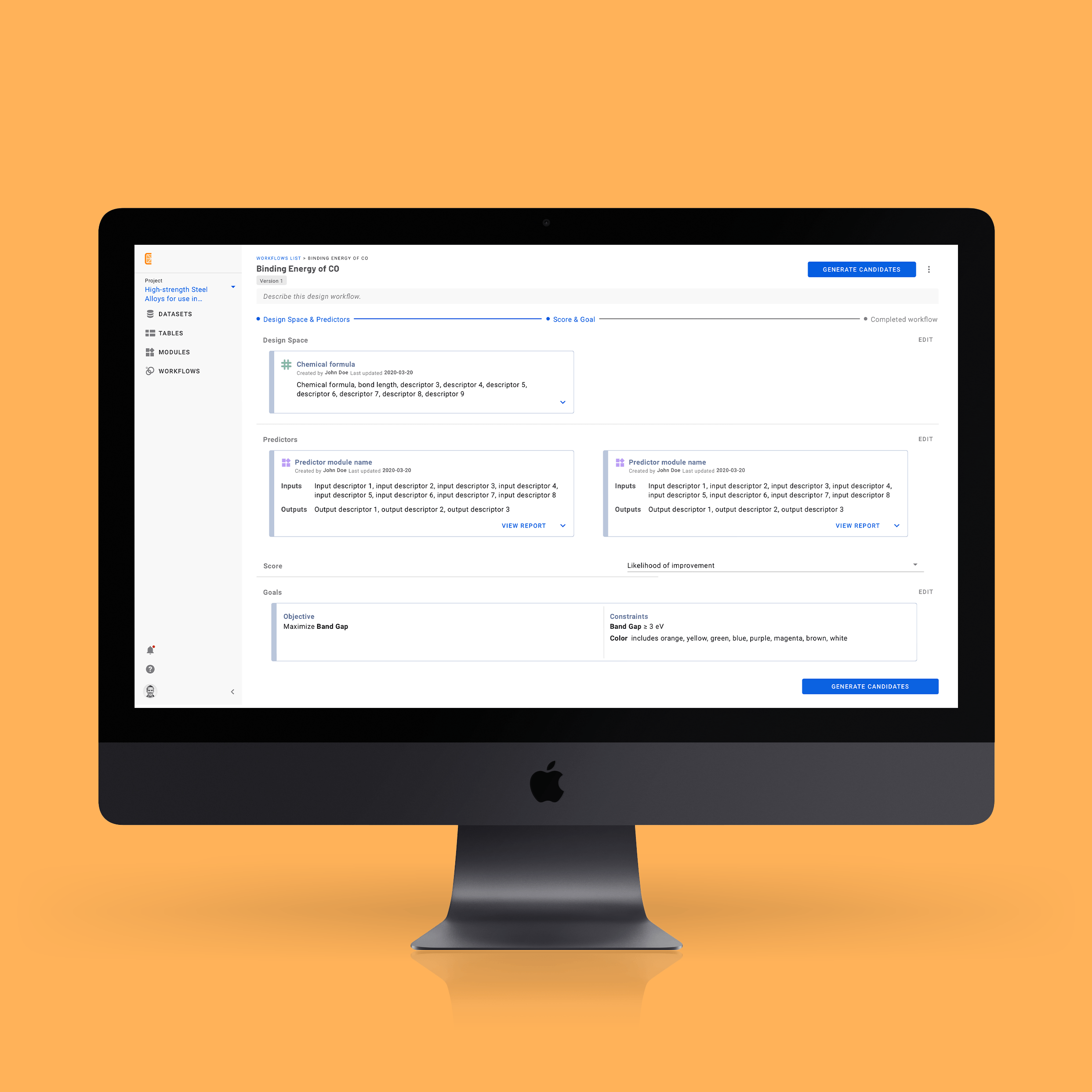
Citrine Informatics | ML workflows 🗝Web platform design
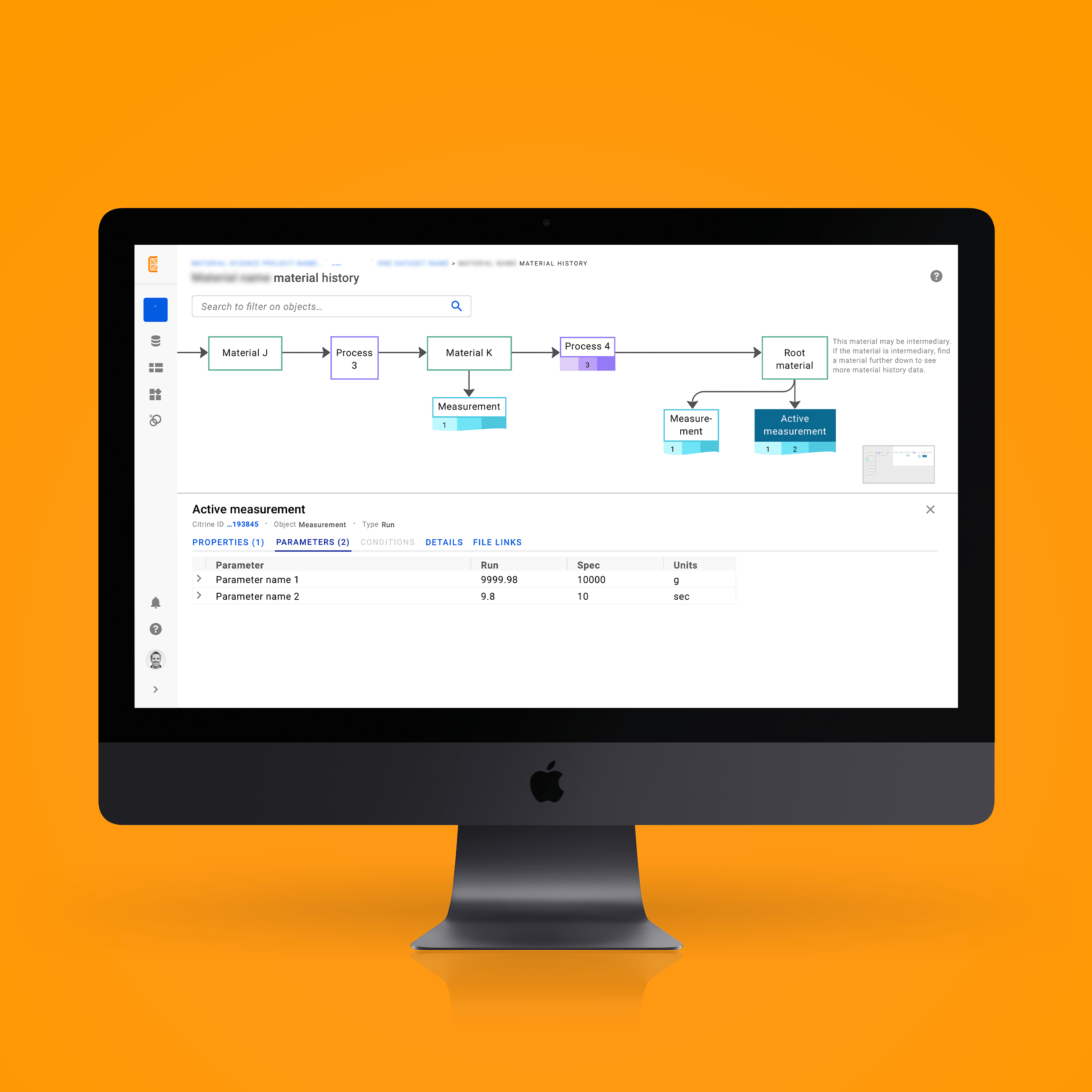
Citrine Informatics | Material history 🗝Web platform design
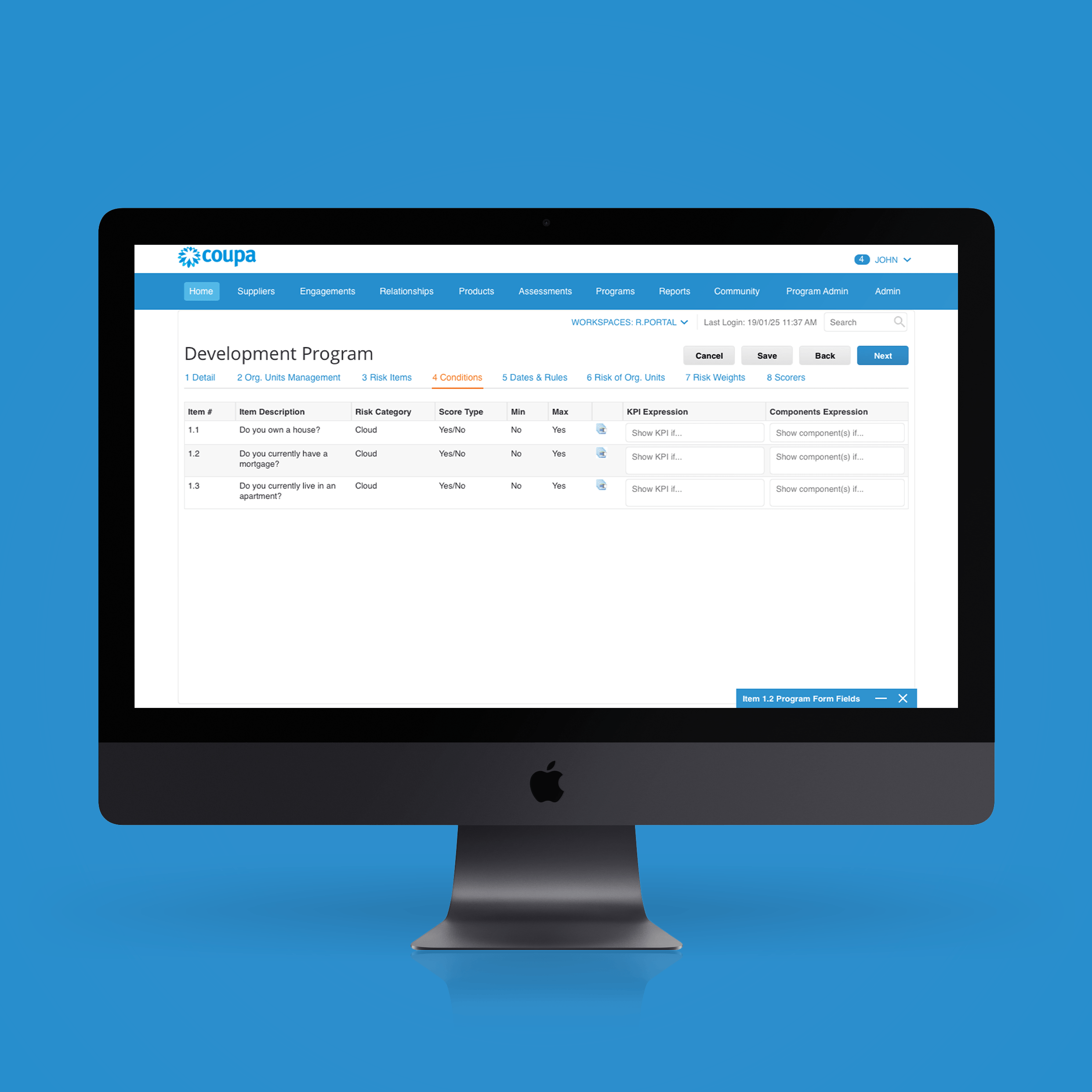
Coupa Software | Risk Assess 🗝Web platform design, Rebranding
Opus | Survey and workflow 🗝Platform redesign
Philips | Project BreatheService design concept
Designed by Michelle Tai | Last Updated 2020-05-13